Redesigning Checkout Experience
Overview
Objective
This project aims at targeting drop offs from the Review Order page.
Why it matters
There was a significant increase in drop offs post 3rd party payment integration
My role
Design
Research
Platform
Android
Mobile web
iOS
For
Snapdeal
Problem Analysis
DATA & problem areas
High number of drop offs from the Review Order page
Data revealed a significant drop-off rate from the Review Order page, that is users who do not go to Select Payment Method CTA on Review Order page after Buy Now CTA on PDP especially on the app, where it reached 32%.
80% users placed COD orders
An overwhelming 80% of the users prefer paying Cash on Delivery, rather than using online payment method. This strong preference shapes our focus on improving the checkout process, especially the payment stage, to ensure a smooth and satisfying shopping experience for the customers; while also improving the prepaid salience.
Cancellations due to address-related issues
10% of order cancellations come from address-related problems.
A common scenario is users canceling their orders due to address-related issues, only to later modify their address details and place the order again. This highlights the need for improved address management and flexibility within the checkout process to reduce these unnecessary cancellations and enhance the overall user experience.
Designing
Any user landing on Checkout page is a high-intend user. A redesign should focus on a smoother experience since user’s decision making is done for the product.
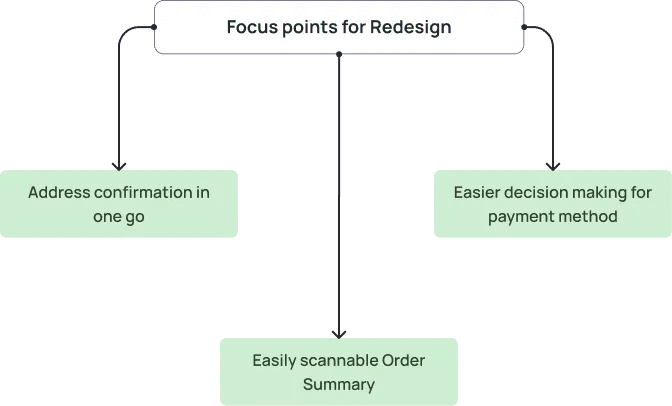
After analysing the data, benchmarking platforms and understanding the current flows, suggestions were made based on the current designs.
Payment Method Options:
No available payment options are visible for the user to choose from.
This might lead to increased mental load, as to how to make the payment and place the order.

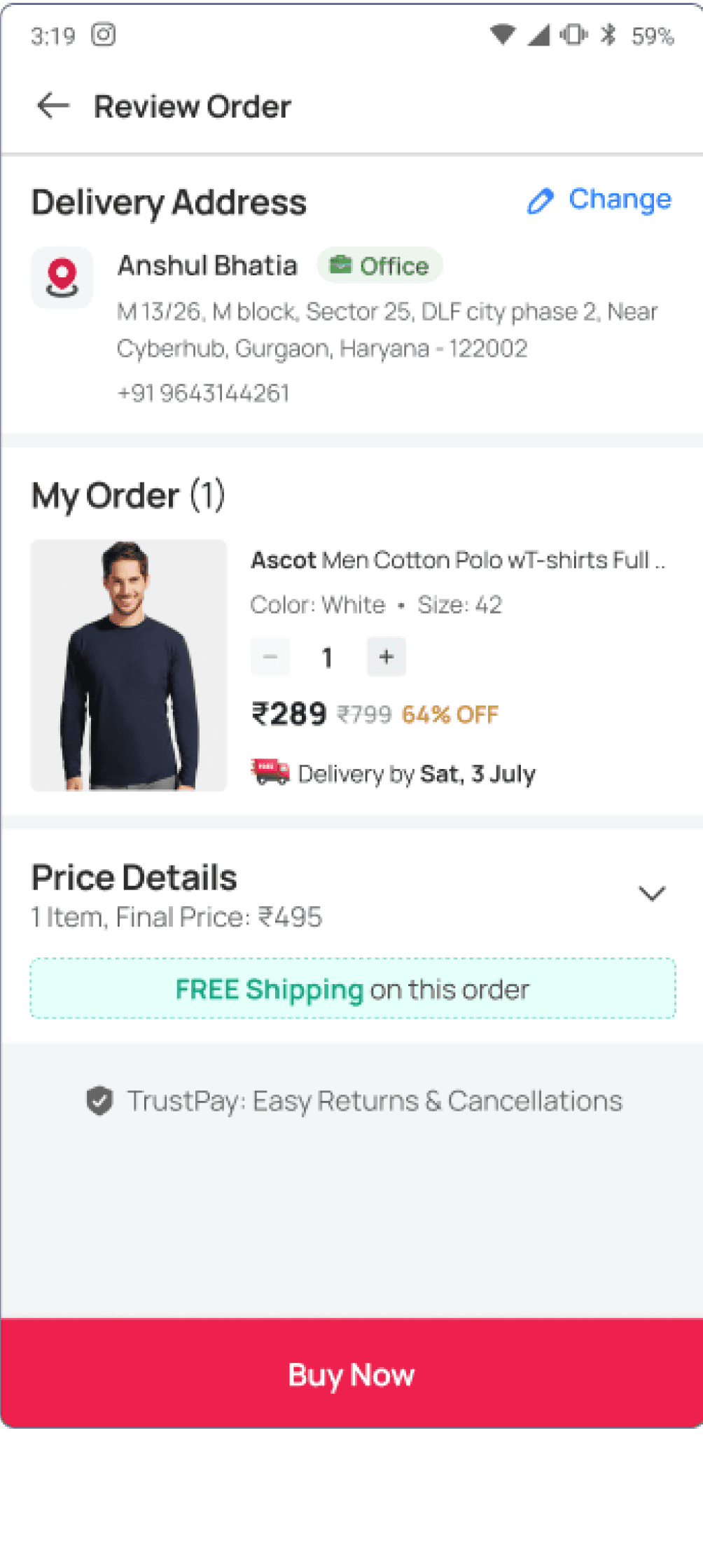

Improved Delivery Address Journeys:
Bifurcation of journeys for Repeat User and First Time Visitors for address-related flows.
Possible by limiting it to Price summary, quantity and estimated delivery date. User’s focus needs to be decision making for payment and to complete the journey.
For New Users
Buy Now
Address Page
Review Order
Juspay
(3rd party payments Page)
Juspay
(3rd party payments Page)
Review Order
Address List Page
(if user has multiple addresses saved)
Skip Address Page
(if user has Single address saved)
For Repeat Users
Buy Now
Redesign
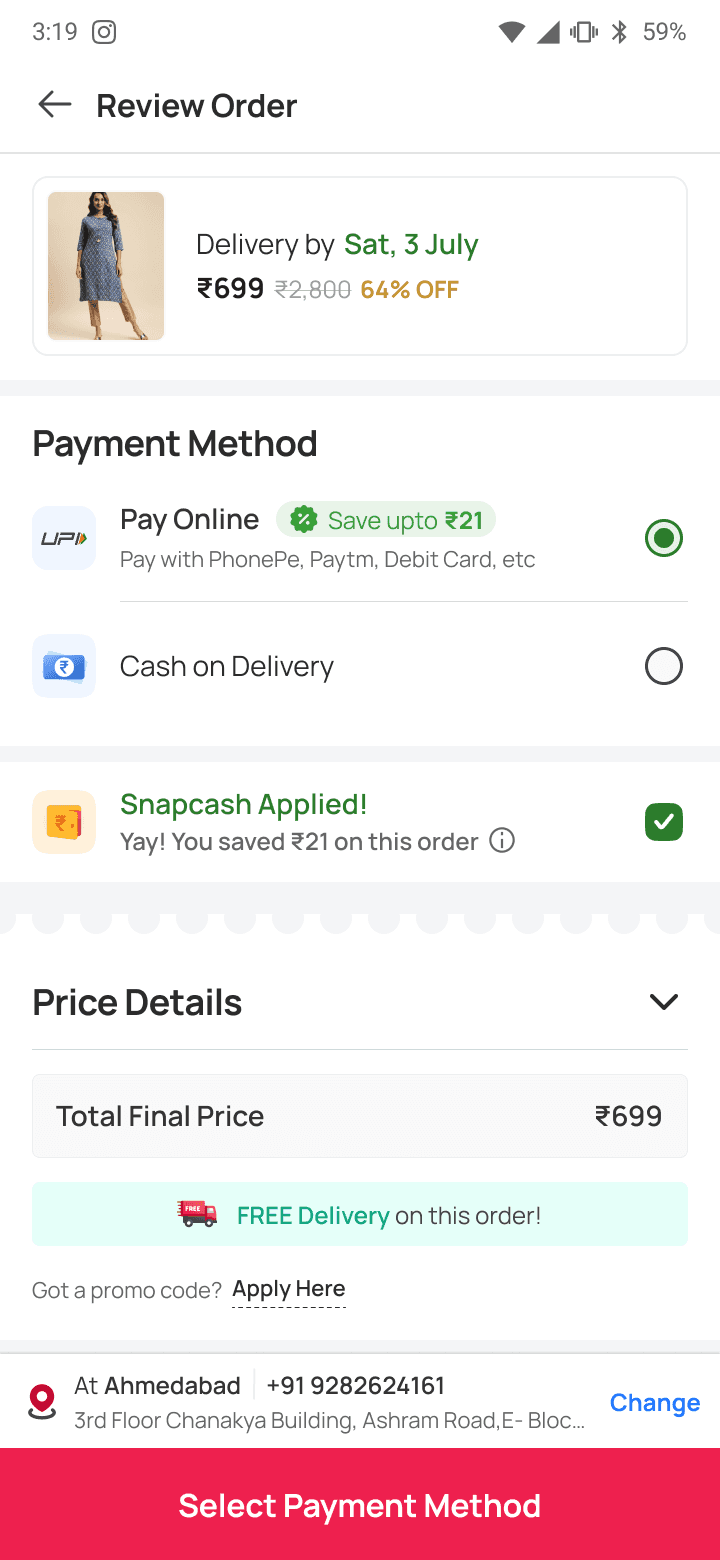
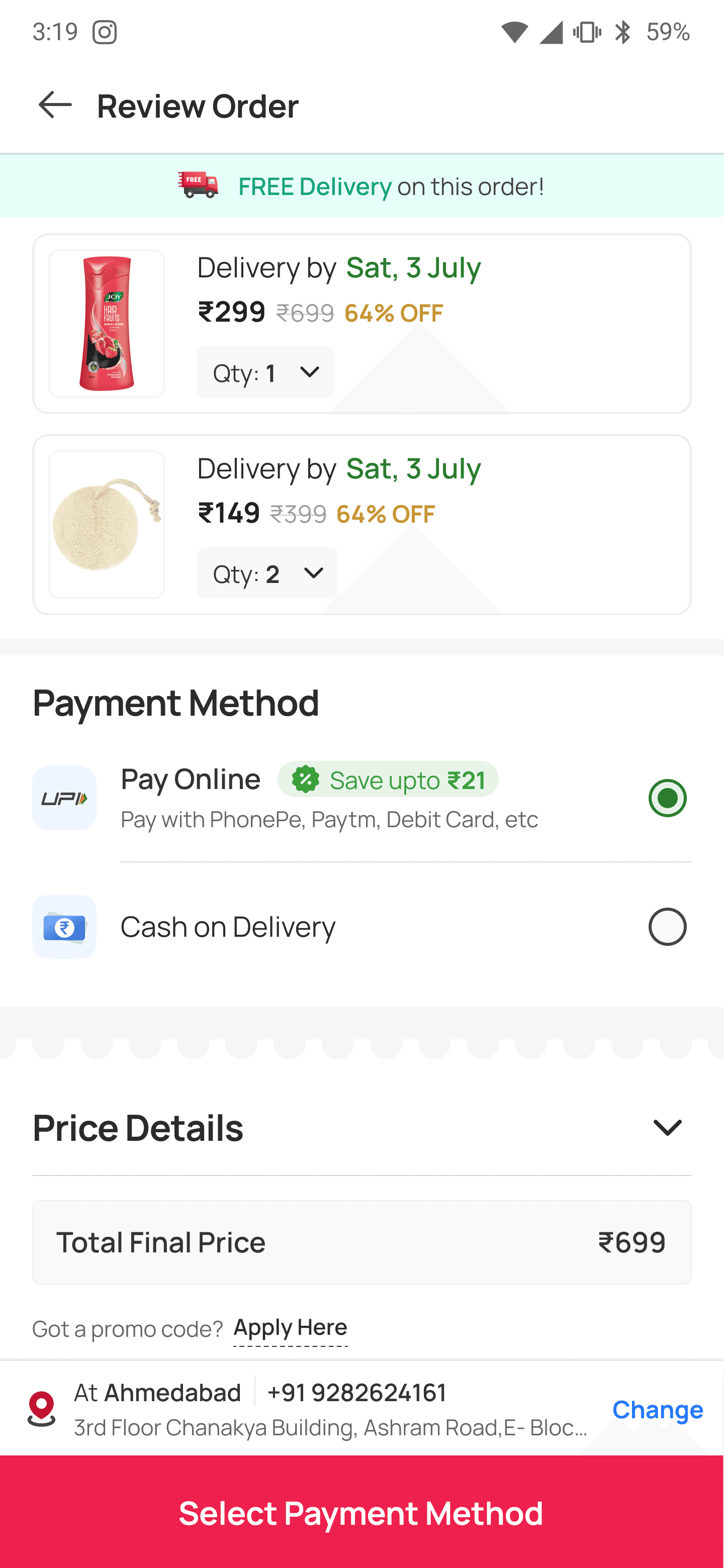
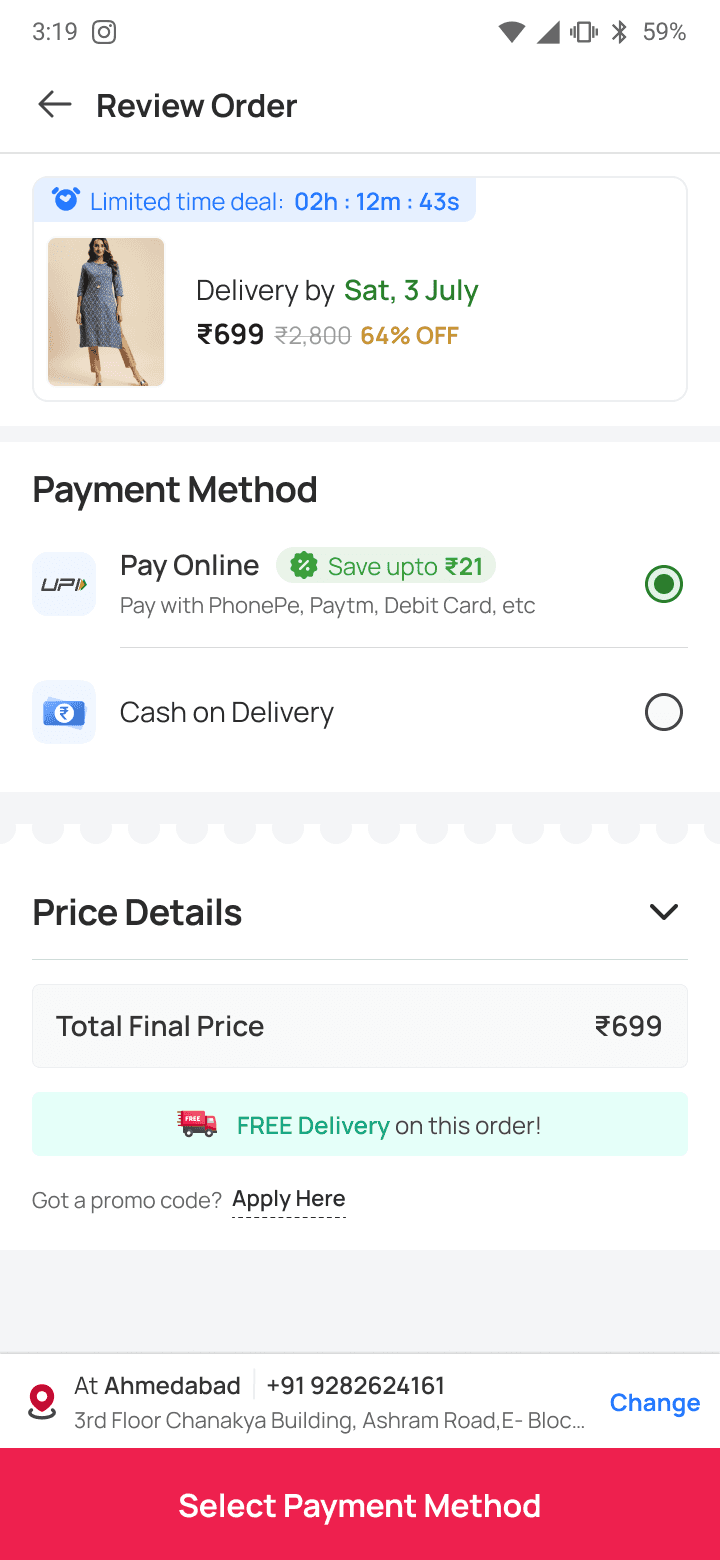
Grouping Payment Options
Grouping and limiting payment method options to the user would decrease the cognitive load & also fasten the process of decision making.
In order to motivate the user to choose online payment method, nudging can be done by showing savings & offers.
Delivery Address Prominence
Proximity next to the CTA for easier scanning and confirmation by the user for delivery.

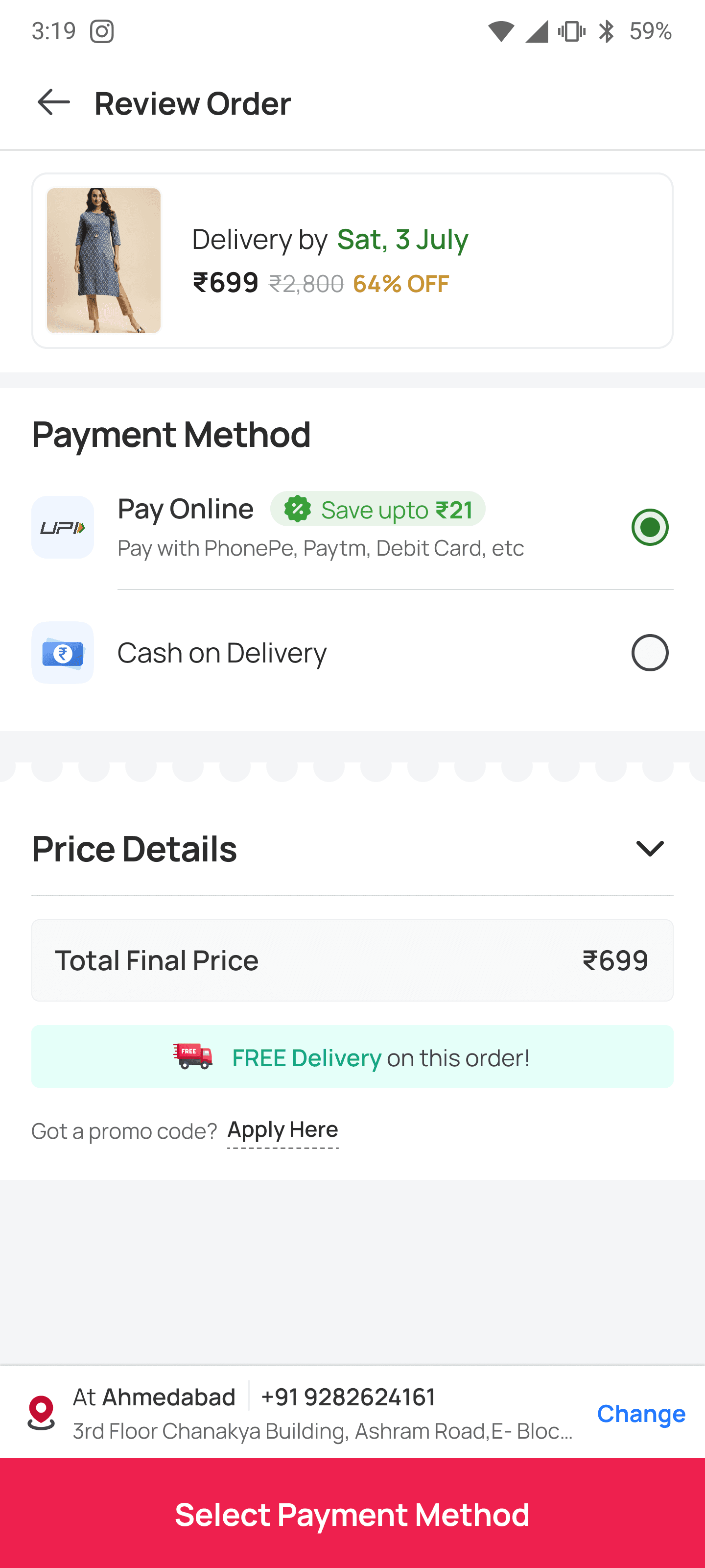
Decluttered Order Summary
User has made their decision about the product. For easier scanning, information that matters the most at this moment - delivery date & product price needs to be given priority
Improved CTA Communication for COD (Place Order) & Pay Online (Select Payment Method)



Impact
2.7% increase
in delivered orders
1.2% increase
in COD orders
bhavika.nanda06@gmail.com
Redesigning Checkout Experience
Overview
Objective
This project aims at targeting drop offs from the Review Order page.
Why it matters
There was a significant increase in drop offs post 3rd party payment integration.
My role
Design
Research
Platform
Android
Mobile web
iOS
For
Snapdeal
Problem Analysis
Data & problem areas
80% users placed COD orders
This strong preference shapes our focus on improving the checkout process, especially the payment stage, to ensure a smooth and satisfying shopping experience for the customers; while also improving the prepaid salience.
High number of drop offs from the Review Order page
Data revealed a significant drop-off rate from the Review Order page, that is users who do not go to Select Payment Method CTA on Review Order page after Buy Now CTA on PDP especially on the app, where it reached 32%.
Cancellations due to address-related issues
10% of order cancellations come from address-related problems.
A common scenario is users canceling their orders due to address-related issues, only to later modify their address details and place the order again. This highlights the need for improved address management and flexibility within the checkout process to reduce these unnecessary cancellations and enhance the overall user experience.




For New Users
Buy Now
Address Page
Review Order
Juspay
(3rd party payments Page)
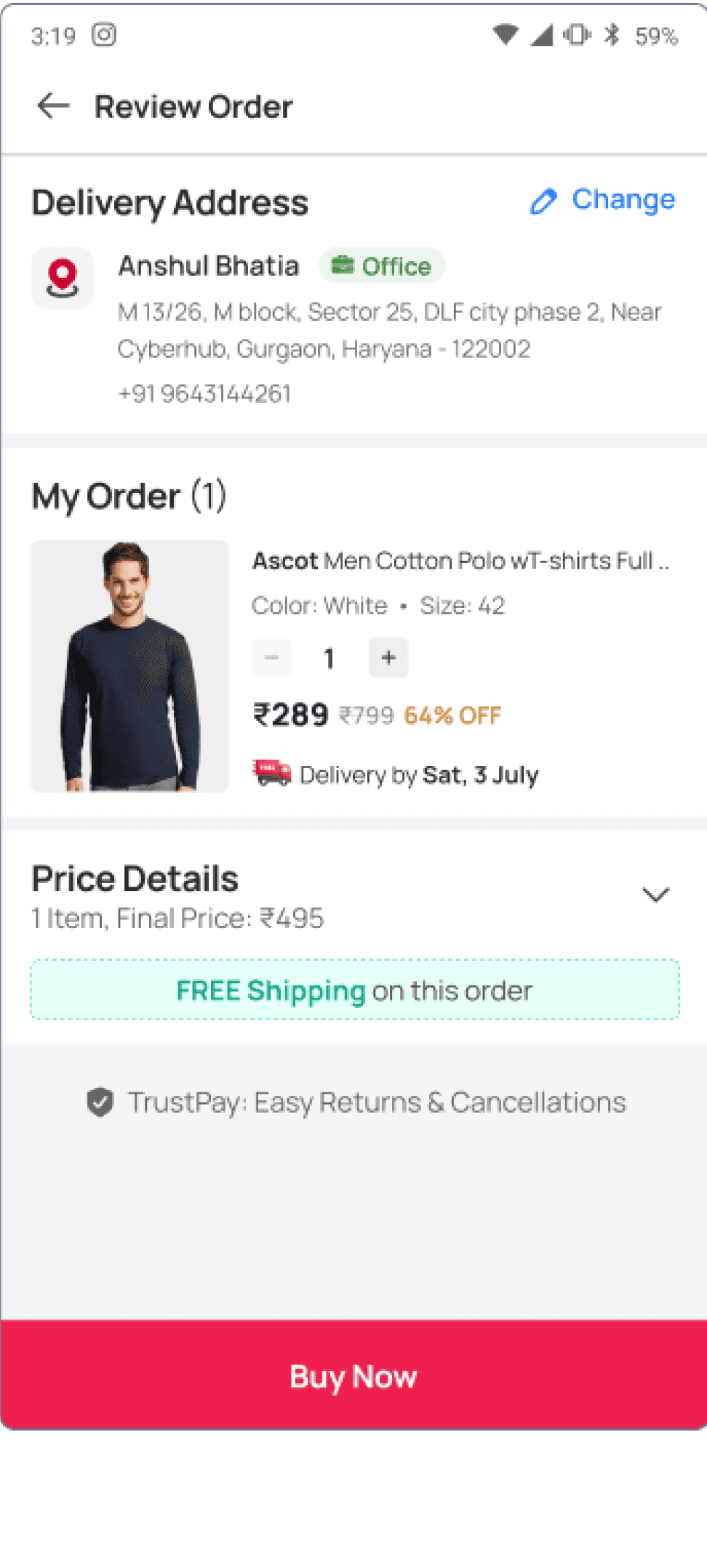
Payment Method Options:
No available payment options are visible for the user to choose from.
This might lead to increased mental load, as to how to make the payment and place the order.
For Repeat Users
Buy Now
Address List Page
(if user has multiple addresses saved)
Skip Address Page
(if user has Single address saved)
Review Order
Juspay
(3rd party payments Page)
Improved Delivery Address Journeys:
Bifurcation of journeys for Repeat User and First Time Visitors for address-related flows.
Possible by limiting it to Price summary, quantity and estimated delivery date. User’s focus needs to be decision making for payment and to complete the journey.
After analysing the data, benchmarking platforms and understanding the current flows, suggestions were made based on the current designs.
Redesign
Grouping Payment Options
Grouping and limiting payment method options to the user would decrease the cognitive load & also fasten the process of decision making.
In order to motivate the user to choose online payment method, nudging can be done by showing savings & offers.
Delivery Address Prominence
User has made their decision about the product. For easier scanning, information that matters the most at this moment - delivery date & product price needs to be given priority
Delivery Address Prominence
Proximity next to the CTA for easier scanning and confirmation by the user for delivery.
Improved CTA
Communication for COD (Place Order) & Pay Online (Select Payment Method)


Impact
2.7% increase
in delivered orders
1.2% increase
in COD orders
Any user landing on Checkout page is a high-intend user. A redesign should focus on a smoother experience since user’s decision making is done for the product.
Designing