Enhancing post-order experience
Overview
Objective
Enhancing user satisfaction beyond checkout by addressing inquiries and complaints related to order status, delivery, and refunds.
Why it matters
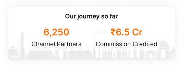
It is a crucial touchpoint that can influence customer satisfaction and loyalty
My role
Design
Research
Platform
Android
Mobile web
For
Snapdeal
Problem Analysis


Existing problem area
Majority of the complaint and/or query calls the team received were around:
where is my order?
when is my order coming?
where is my refund?
when will my order be returned?
User Research takeaways
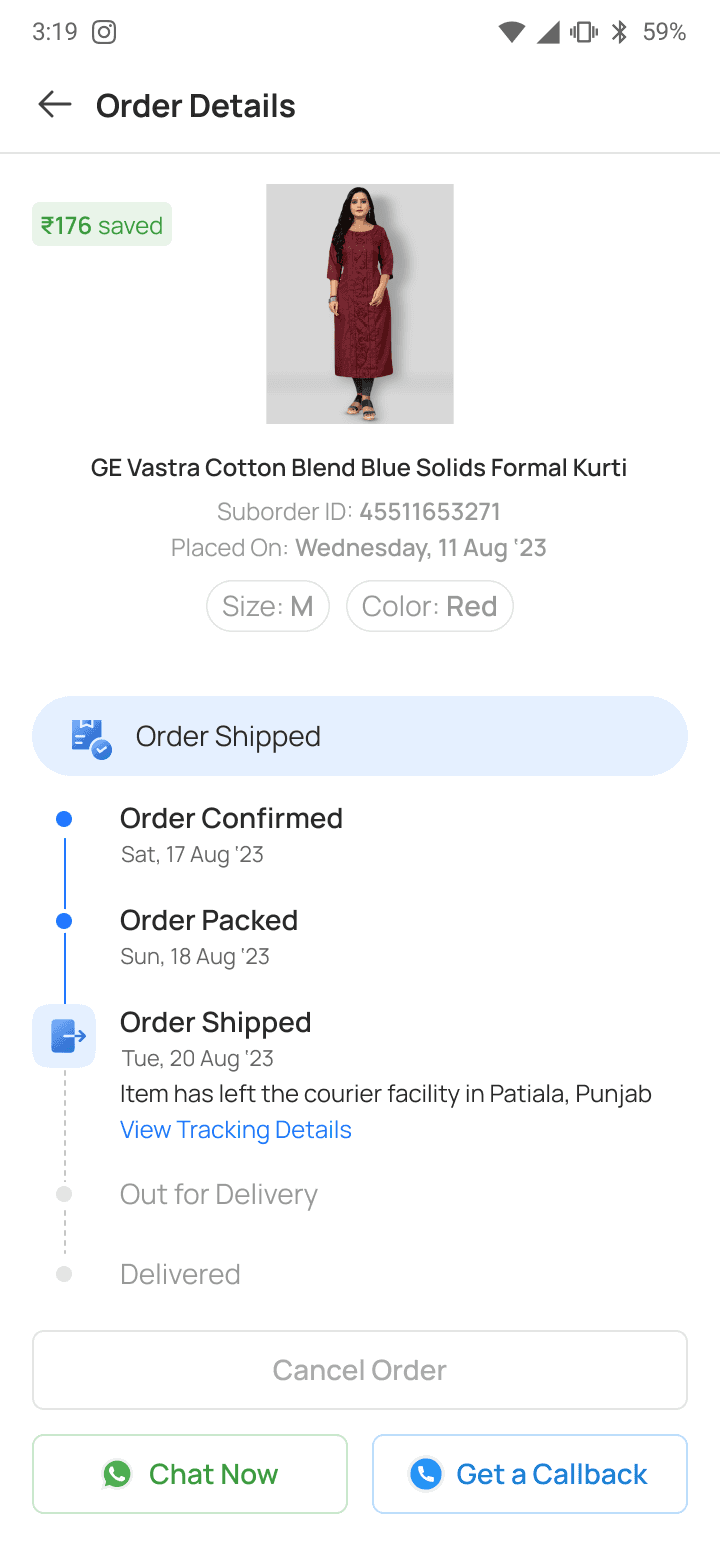
User has to read through the order statuses before assuming the estimated delivery date
Users have a clear understanding of order statuses, mainly shipped and out for delivery
Users have a clear understanding of the word “track”
High interaction with WhatsApp messages regarding Order Status
Great dependency on delivery agent’s call in case of Out for Delivery
Users expect one number to connect with the customer care when they click on Call Me back CTA.
If their delivery experience was bad, they came to return the product. Few of such users either needed assistance in returning the product
User’s biggest pain point at delivery stage is expectation mismatch. This could be for the following reasons:
wrong product delivered
size issue
parts missing
product dimension different from image
defective product
Initial iterations
One widget for all
help-related touchpoints
Delivery address

First fold prioritised:
delivery/pickup date
order status
Concise information about
the purchased product
Details page with extra
information about the order
Insights gained from the usability test
Users had to go through the information again to assume the estimated delivery date
Sense of assurance around refund/return was not there
Lack of visibility of refund amount
Users could figure out what would be their next step if they required help
Users could not understand the order status in one go
Along with that few special cases like Out for Delivery, importance was given to the type of payment
The status was given equal importance to the current status, along with an estimated delivery/pick-up date.
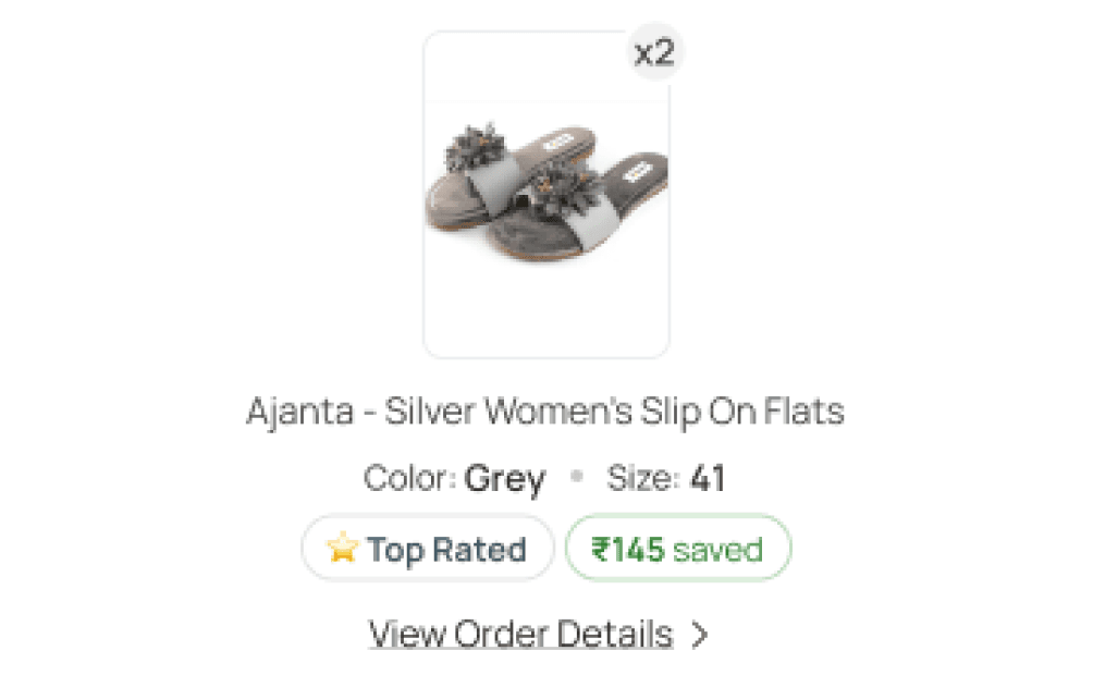
providing nudges to suggest that the user is purchasing the right product, such as indicating that the product is top-rated or highlighting how much they are saving with the purchase.
The user can initiate a call with the delivery agent from here as well.
Insights gained from the usability test
Clarity of product ordered
Status & next actionable still unclear to some
Not sure of the delivery date
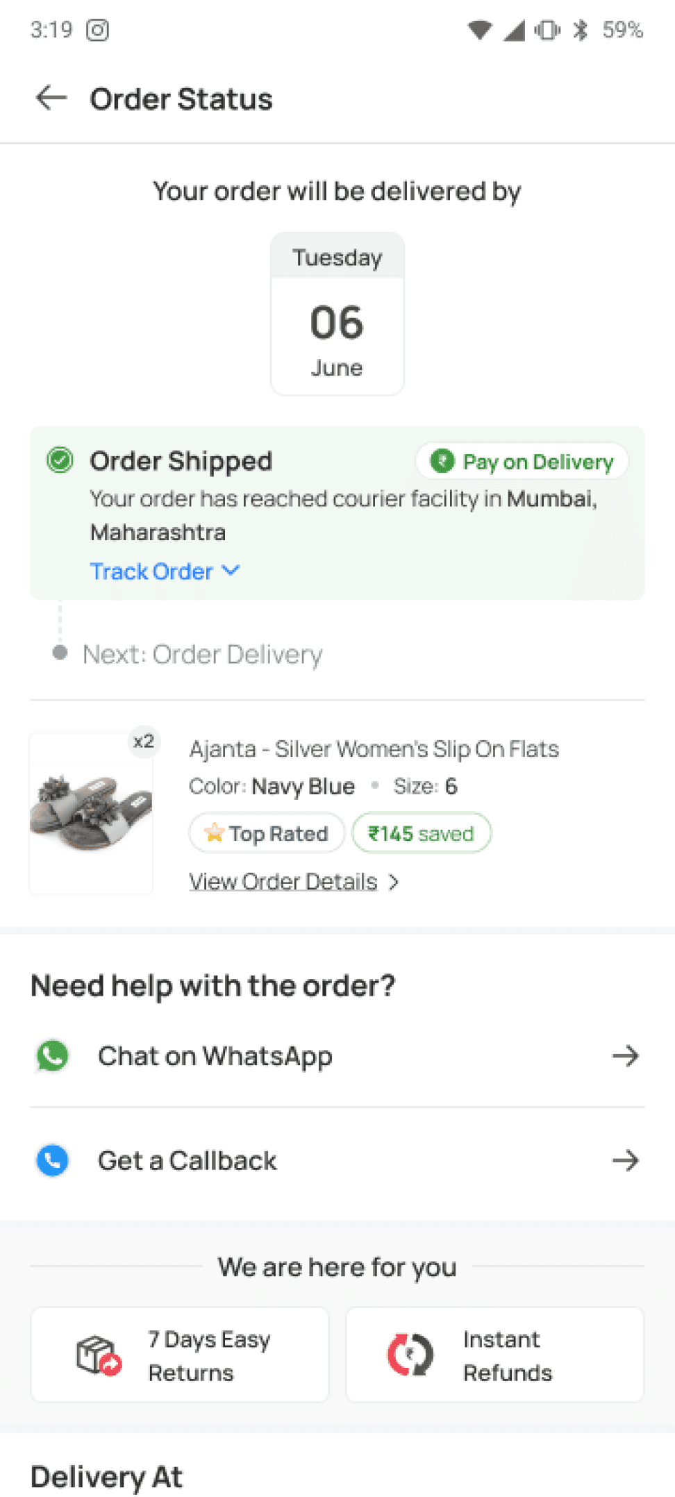
Redesign

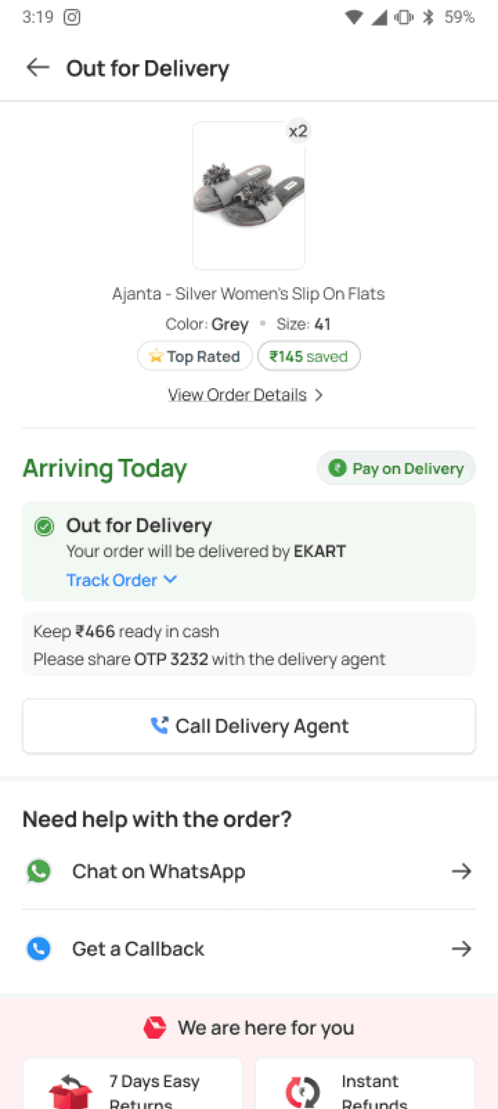
visuals indicating the delivery date
Highlighting current status, along with micro animation
One widget for all
help-related touchpoints
Social proofing based on the status of the order
in case of out for delivery, the UI was designed to give a humanised feeling, that showed as if the delivery partner is chatting with the user. This built more trust & transparency.
Accessible calling CTA
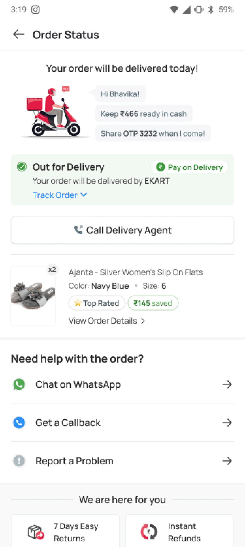
Insights gained from the usability test
Clarity about the status & the respective date
Touchpoints for return & calling seemed more accessible
Expected impact
Improved NPS
measure customer sentiment. are they happy?
No. of agent calls received
whether agent dependency increased or decreased
Delivery acceptance / pick up success
has communication between user & delivery person improved?
bhavika.nanda06@gmail.com
Enhancing post-order experience
Overview
Objective
Enhancing user satisfaction beyond checkout by addressing inquiries and complaints related to order status, delivery, and refunds.
Why it matters
It is a crucial touchpoint that can influence customer satisfaction and loyalty
My role
Design
Research
Platform
Android
Mobile web
For
Snapdeal
Problem Analysis
Existing problem area
Majority of the complaint and/or query calls the team received were around:
where is my order?
when is my order coming?
where is my refund?
when will my order be returned?
User Research takeaways
Users rely on order statuses like "Shipped" and "Out for Delivery" but must read through details to find the estimated delivery date.
High engagement with WhatsApp updates and delivery agent calls for "Out for Delivery" stage.
Users expect a single customer care number via the "Call Me Back" CTA.
Delivery issues lead to returns, often requiring assistance (e.g., wrong product, size issues, missing parts, defective items, or dimension mismatches).
The biggest pain point is expectation mismatch during delivery.
Redesign
Visuals indicating the delivery date
Highlighting current status, along with micro animation
One widget for all help-related touchpoints
Social proofing based on the status of the order
In case of out for delivery, the UI was designed to give a humanised feeling, that showed as if the delivery partner is chatting with the user. This built more trust & transparency.
Insights gained from the usability test
Clarity about the status & the respective date
Touchpoints for return & calling seemed more accessible
Expected impact
Improved NPS
measure customer sentiment. are they happy?
No. of agent calls received
whether agent dependency increased or decreased
Delivery acceptance / pick up success
whether agent dependency increased or decreased
First fold prioritised:
delivery/pickup date
order status
concise information about the purchased product
details page with extra information about the order
one widget for all help-related touchpoints
Insights gained from the usability test
Users had to go through the information again to assume the estimated delivery date
Sense of assurance around refund/return was not there
Lack of visibility of refund amount
Users could figure out what would be their next step if they required help
Users could not understand the order status in one go
Initial iterations

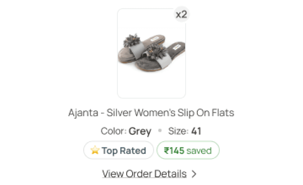
Providing product-related nudges to suggest that the user is purchasing the right product, such as indicating that the product is top-rated or highlighting how much they are saving with the purchase.
The user can initiate a call with the delivery agent from this page itself
Along with that few special cases like Out for Delivery, importance was given to the type of payment
Insights gained from the usability test
Clarity of product ordered
Status & next actionable still unclear to some
Not sure of the delivery date